
Design has the power to shift how we feel, think, and act in any environment. From the room we live in to the websites we use daily, design speaks without words. It determines whether a space feels welcoming, overwhelming, joyful, or dull. Yet behind the most successful designs whether interiors, graphics, or architecture lies a set of timeless principles. These principles act as the foundation, guiding designers to create beauty, functionality, and emotional connection. In this article, we’ll explore seven genius design principles that can transform any space into something memorable. Whether you’re an aspiring designer, a homeowner, or just curious about what makes design effective, these insights will help you see the world through new eyes.
Balance in Design
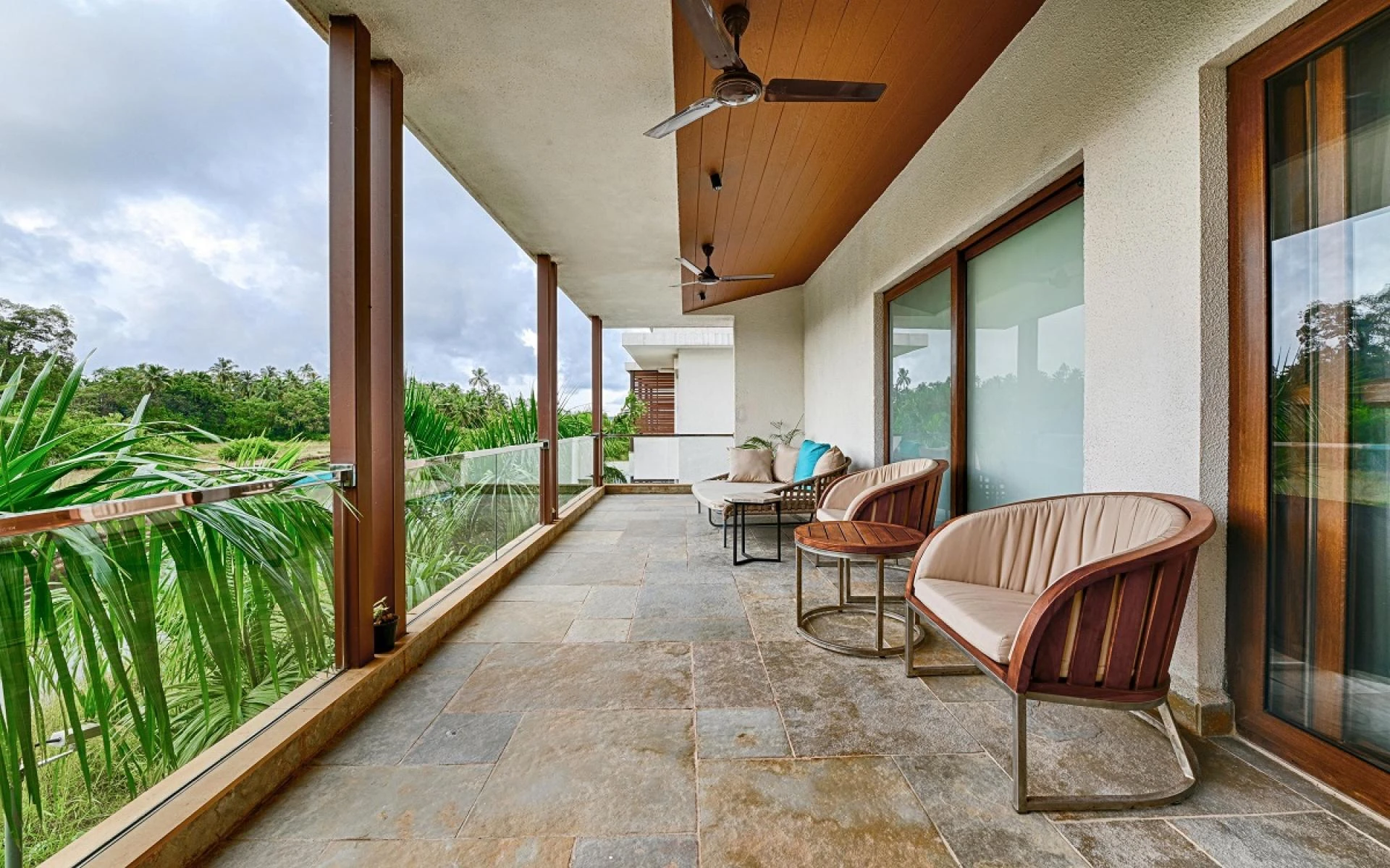
Balance is the bedrock of good design. Imagine walking into a room where one side is filled with heavy furniture while the other side looks empty immediately, it feels “off.” Balance helps distribute visual weight so a space feels anchored and harmonious. Designers often use symmetry to create a sense of order, but asymmetry can also be powerful when executed with intention. For example, an asymmetrical living room may feel dynamic and modern if elements are thoughtfully aligned. Beyond interiors, balance is also critical in graphic and digital design, where text and imagery must work together without overwhelming the viewer. Whether through symmetry or controlled asymmetry, balance provides the stability that allows creativity to shine.
Contrast Creates Energy
Without contrast, design falls flat. Contrast introduces variety and excitement into any visual experience. It may come in the form of color opposites, like black against white, or textural differences, such as sleek glass next to raw stone. Good contrast not only draws attention but also communicates importance it highlights what we should focus on first. In graphic design, for example, bold typography paired with minimalist backgrounds ensures the message stands out. In interiors, contrast can mean dark cabinetry against bright countertops or contemporary furniture mixed with rustic accessories. When contrast is used wisely, it injects energy into a space and invites exploration.
Harmony and Unity in Style
If contrast ensures drama, harmony ensures peace. Harmony and unity refer to the sense of cohesion across all design elements. It’s what makes a space or visual composition feel intentional rather than chaotic. A unified color palette, repetition of materials, or consistent design language can tie everything together. Think of a well-designed website: the buttons, fonts, and images align seamlessly, leading to a flawless user experience. Similarly, in interiors, the repetition of metals or woods can subtly unify a room. While contrast grabs attention, harmony ensures longevity it turns a design into something timeless rather than just a passing statement.
Scale and Proportion That Fit the Space
Design can fail quickly if scale and proportion are ignored. A massive sofa crammed into a compact apartment feels suffocating, while tiny artwork on an expansive wall feels lost. Scale refers to the size of objects in relation to space; proportion addresses how they relate to each other. Designers use these principles to balance function and aesthetics, ensuring the whole space feels well-measured. In digital design, proportion exists too for example, how images balance with text in a webpage layout can determine whether readers feel comfortable or distracted. Good proportion respects the human experience, making the design functional as well as visually pleasing.
The Power of Emphasis
Emphasis in design creates a focal point the element that grabs attention at first glance. Without emphasis, a space or page may lack clear direction. Designers use emphasis to guide the eye purposefully, whether it’s through a bold accent wall in an interior, a statement piece of art, or an enlarged image banner at the top of a website. Emphasis doesn’t only highlight aesthetic value but also communicates priority. In branding design, emphasis ensures the logo and key message dominate, leaving no confusion about identity. Ultimately, emphasis supports storytelling in design, giving people something to remember long after they leave the space.
Rhythm in Design
Just like music, design has rhythm. Rhythm is established when elements are repeated in a sequence or pattern, producing a sense of movement. In interiors, repetition of shapes such as arched doorways or circular light fixtures creates subtle rhythm that flows through the space. In graphic design, rhythm might mean consistent header styles or patterned backgrounds. This principle bridges functionality with artistry, helping the eye travel without strain. Through rhythm, roof maxx reviews, a design feels alive, weaving unity into repetition in an engaging way. Proper rhythm reassures the observer that the design wasn’t accidental but thoughtfully choreographed.
Function Meets Aesthetics
The most remarkable designs balance form with function beauty must never come at the cost of usability. A visually stunning chair that’s uncomfortable defeats its purpose, just as a sleek website that’s confusing frustrates its audience. Designers must always ask: does the design solve a problem while remaining beautiful? In architecture, this principle plays out in sustainable designs where energy efficiency meets elegance. In branding, user-friendly packaging that still conveys luxury is a good example. By aligning usability with aesthetic appeal, design transforms from decoration into a truly enriching experience.
Design in the Real World
These principles aren’t abstract; they influence real-world design every day. From the way cities plan architecture to how companies organize branding, design decisions shape experiences. For example, when modern architectural updates breathe new life into old structures, both balance and rhythm play critical roles. Companies like Classic Roofing Restoration showcase how design principles extend even to restoration projects, where form and function must merge seamlessly. By combining aesthetics with durability, such projects prove that timeless design principles never go out of style.
Why Design Will Always Evolve
Design is never stagnant it continuously evolves to respond to culture, technology, and human needs. Today’s trends highlight biophilic design, where natural elements bring calm into spaces, and minimalism, which strips environments down to their essentials. Technology-driven design, like augmented reality and smart homes, pushes boundaries further. Yet even with new tools, the core principles remain unchanged. Balance, emphasis, and harmony will always be relevant because they speak to our innate sense of beauty and order. Understanding these basics means you can adapt to trends while still creating enduring designs.
Conclusion
Design, whether in a small home or global brand campaign, has the power to change how people feel and behave. By learning and applying principles like balance, contrast, harmony, rhythm, scale, emphasis, and functionality, we can transform ordinary spaces into extraordinary experiences. These timeless concepts lay the foundation for creativity, allowing designs to evolve while remaining effective. As spaces, lifestyles, and technologies change, these principles guide us in building environments and visuals that inspire, comfort, and connect. Ultimately, good design is about blending art with intention and when done right, it has the power to transform the way we live.


Sign in to leave a comment.